I've been reviewing some of my images lately, from trips taken in the past couple years and - as I do from time to time - have reprocessed several. In some cases it was to do b/w conversions, in other cases it was to see how new features in Lightroom might help. In yet other situations, it was to totally reconsider the initial rejection of an image for either aesthetics or some other lack of visual impact.
The first two reasons are pretty self explanatory - and I will show some examples - but the third might be a little harder to understand. I mean, if the image didn't grab my eye the first time, what would make me think it could do so months, if not years, later?
The answer is a two fold growth, or evolution. My growth, or increased visual acumen lets me see the possibilities in a certain image that I had not before. The evolution of the processing tool(s) I use has also opened up new opportunities for images that might have been somewhat lack-lustre in the past.
While the title of this project highlights the new Dehaze tool (available in both Lightroom CC and Adobe Camera Raw), the project is not entirely hinged on that one feature, as I hope you'll see.
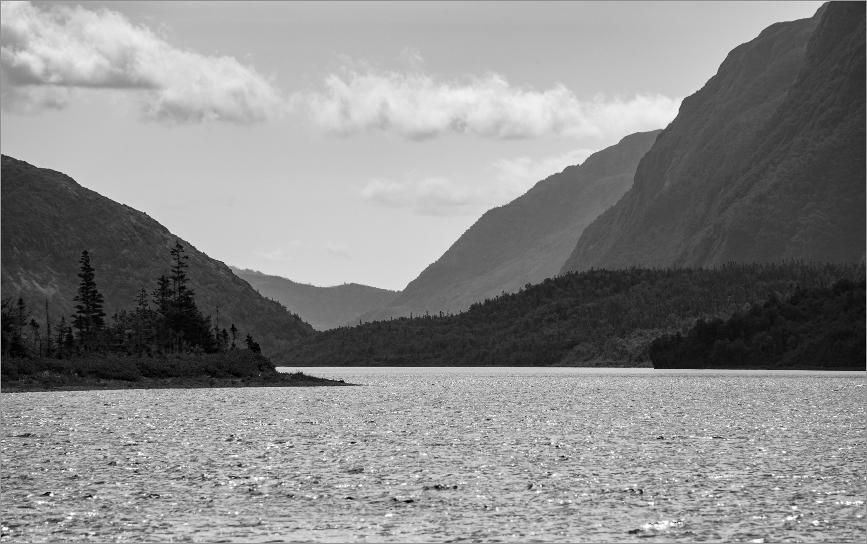
Example #1 - Color to B/W Conversion
This shot was not even in my top picks, originally, because it was very low in contrast, consisted of flat, dull color and didn't really seem to have much detail. There was some potential due to the haze-created depth, but it just didn't grab me that first time around.
Then earlier this week, I was wandering through the images from the latest Excellent Adventure (V.9 - Newfoundland), looking for just the right image to use in a new Adobe Post social graphic, I came across this shot again. It hit me that this image - with some work, would likely make a good b/w shot. I also thought the new Dehaze effect could improve this image dramatically.
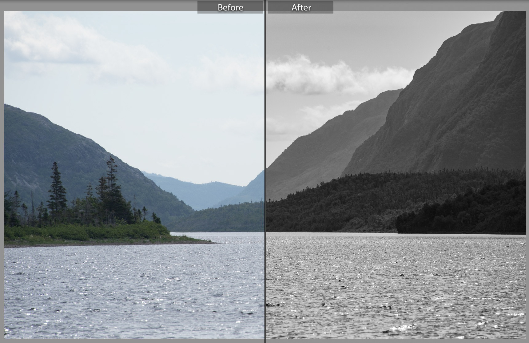
A quick b/w conversion in Lightroom, followed by a Before/After comparison, told me immediately that my instincts were correct. The blah, weak colors created by both the atmospheric haze and light direction translated to subtle variations in tone when converted to black and white.
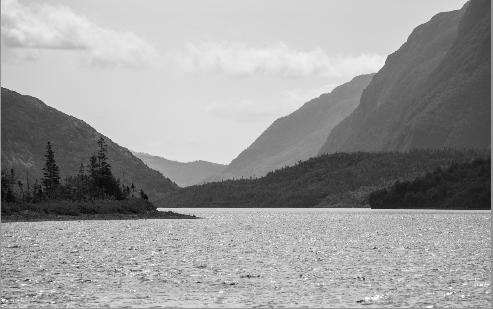
The initial conversion was a good start, but the image still suffered in much the same way as its color counterpart. It was still too flat.
By further reducing the Aqua and Blue channels in the B/W Color Mixer, and applying +30 Dehaze to the overall image, I rescued a shot that might otherwise have sat on an external drive, lingering in anonymity. And I'm very pleased with the overall result.
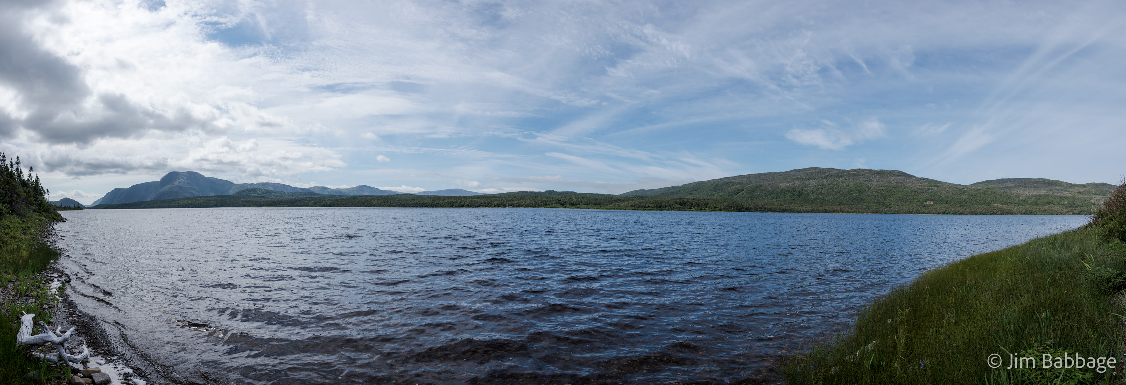
Example #2 - Linear Gradient Filter for Locally Applied Dehaze
The first version below is the initial processing results for the panorama. Not bad, perhaps, but the clouds were washing out on the left and the contrast between the blue sky and clouds didn't pack much of a punch.
I knew applying Dehaze to the entire image would have a negative impact on my foreground, so instead I selected the Linear Gradient tool, and dragged a gradient filter from the top of the image to the horizon. The pink "mask" area denotes the filter location. Note how it gradually fades to nothing.
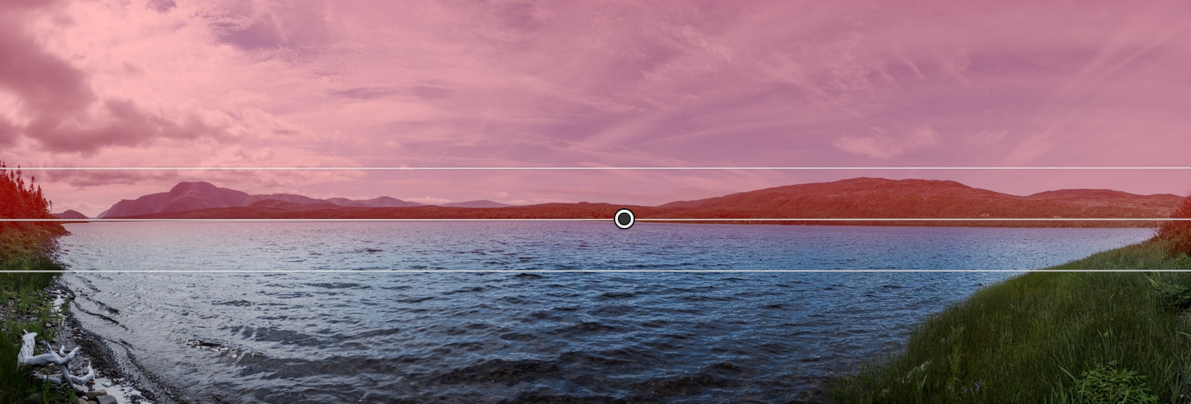
I applied +30 Dehaze to the filter and also took the opportunity to knock the Highlights value back by another 30%, to add more detail and separation to the clouds on the left. Doing so in the Linear filter meant there'd be no additional changes to the highlights of the bleached driftwood in the lower left. While not criitical in this image, I could have also used the Erase brush to remove the filter effects from the foliage on the left and right.
Tip: One nice thing about using local adjustments like the Brush, Radial or Linear Gradient filters is that Dehaze is just part of the toolset; if you don't use the local adjustments, and want to apply Dehaze to the entire image, you have to scroll down to the Effects panel and apply it from there.

Bumping up the blue sky was achieved with the Targeted Adjustment tool, found in the HSL/Color/B/W panel. If you've never used targeted adjustments - start. They give you phenomenal control over color hue, saturation and (in b/w) tonal balance.
Example #3 - The Night Sky
As is pretty evident from the Before/After, a lot was done to this image. Before Dehaze, I would experiment with Clarity and Color Balance settings to improve my night sky shots. And while I still use Clarity and Color Balance, Dehaze has by far become a tool that really produces steller results.
Sorry, I couldn't help myself.
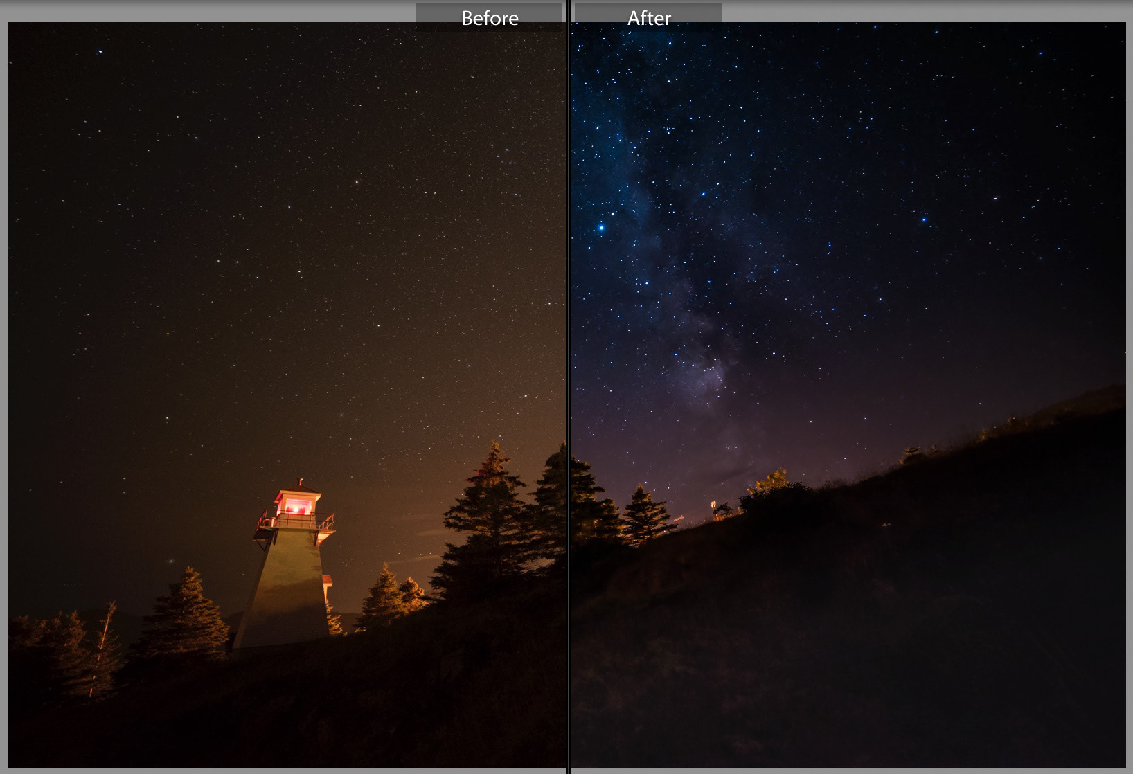
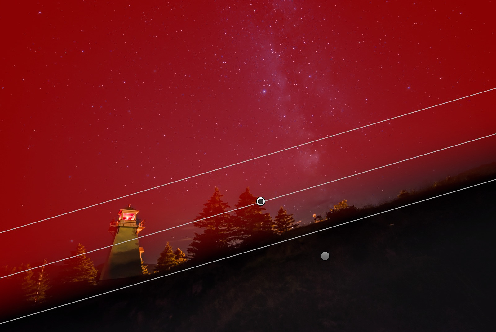
In this case, note that there is no red mask covering the Lighthouse. I used the Erase brush with the Linear Gradient still active, to remove the effect from the lighthouse, simply by painting over it.
Note: the night sky image also includes some strategically placed radial gradient filters to emphasize the Milky Way, and another Linear Gradient to bring out subtle detail in the foreground.
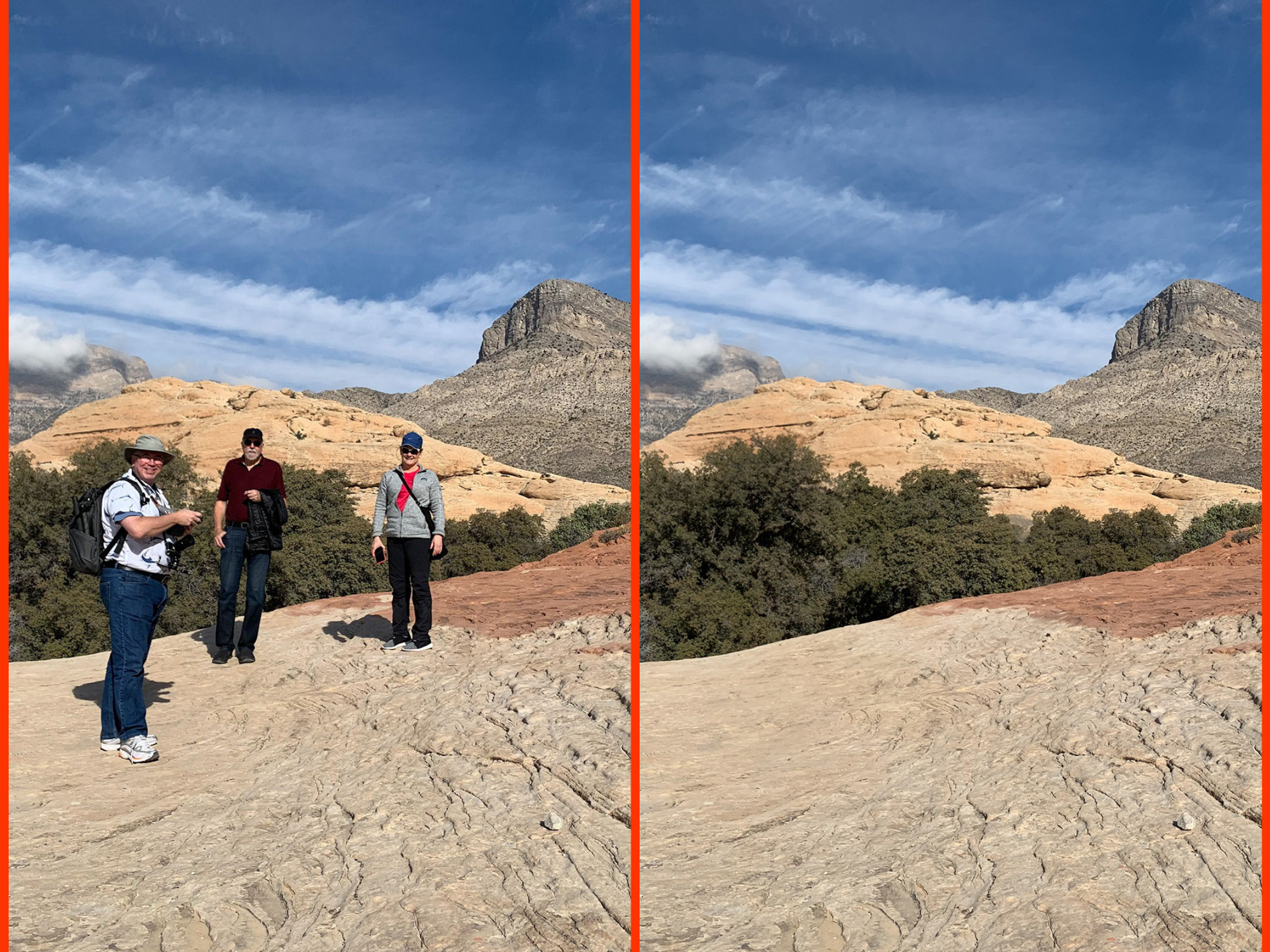
Example #4 - Easy-Peasy Maximum Dehaze-y
Interestingly enough, this image is what inspired me to write this tutorial in the first place. One of the rejects from Excellent Adventure V.8 - Sonoma and the California Coast, I was astounded at the difference Dehaze made to what was originally a pretty forgettable image.
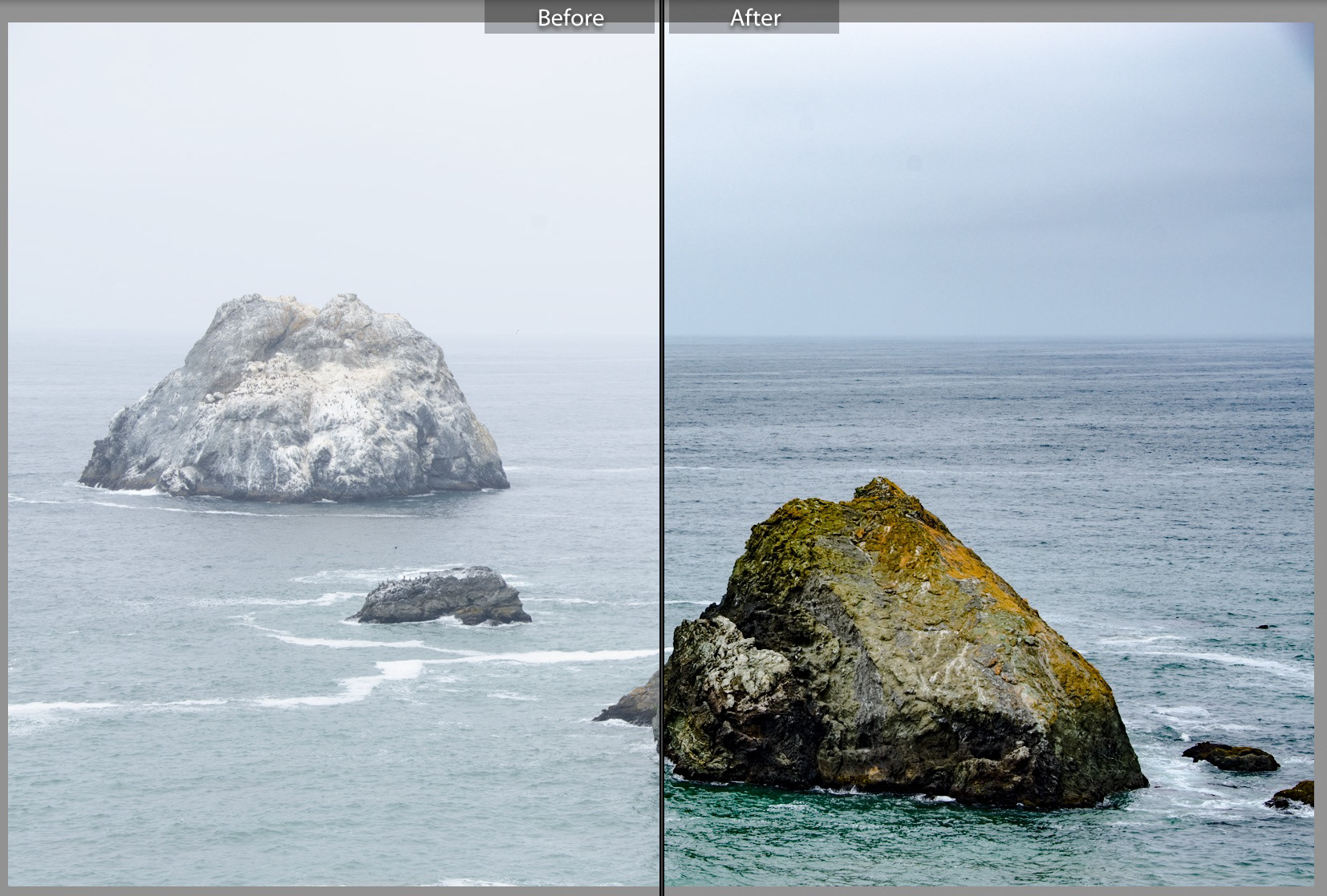
The original - albeit unprocessed - image was nearly monochromatic and totally lacking in contrast.
For the hell of it, I applied about +40 Dehaze as a general adjustment. Just to see if the image had any potential. And indeed it did! I continued to experiment with the photograph, eventually settling on +80 (I know, right?) Dehaze.
Now being this heavy-handed with the Dehaze tool is not often a good idea, as you'll soon learn if you try it. But with an image that was so low in contrast and so impacted by water vapour, Dehaze did an amazing job. In conjunction with this heavy application of Dehaze, I also reduced the Contrast value into the negative, and increased the Shadows value to just over 60%.
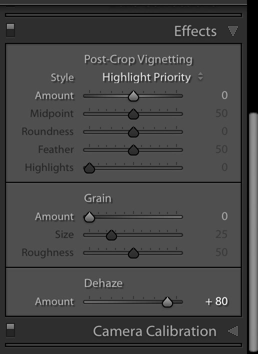
The final image truly benefited from a high Dehaze value. Bumping up the Shadows and redcuing the contrast brought things back to a more natural look.
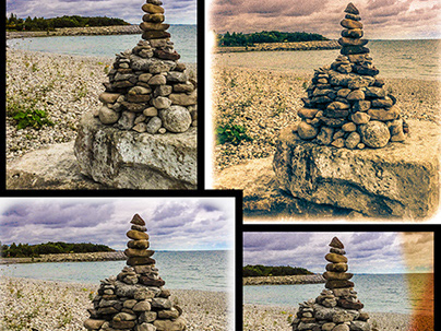
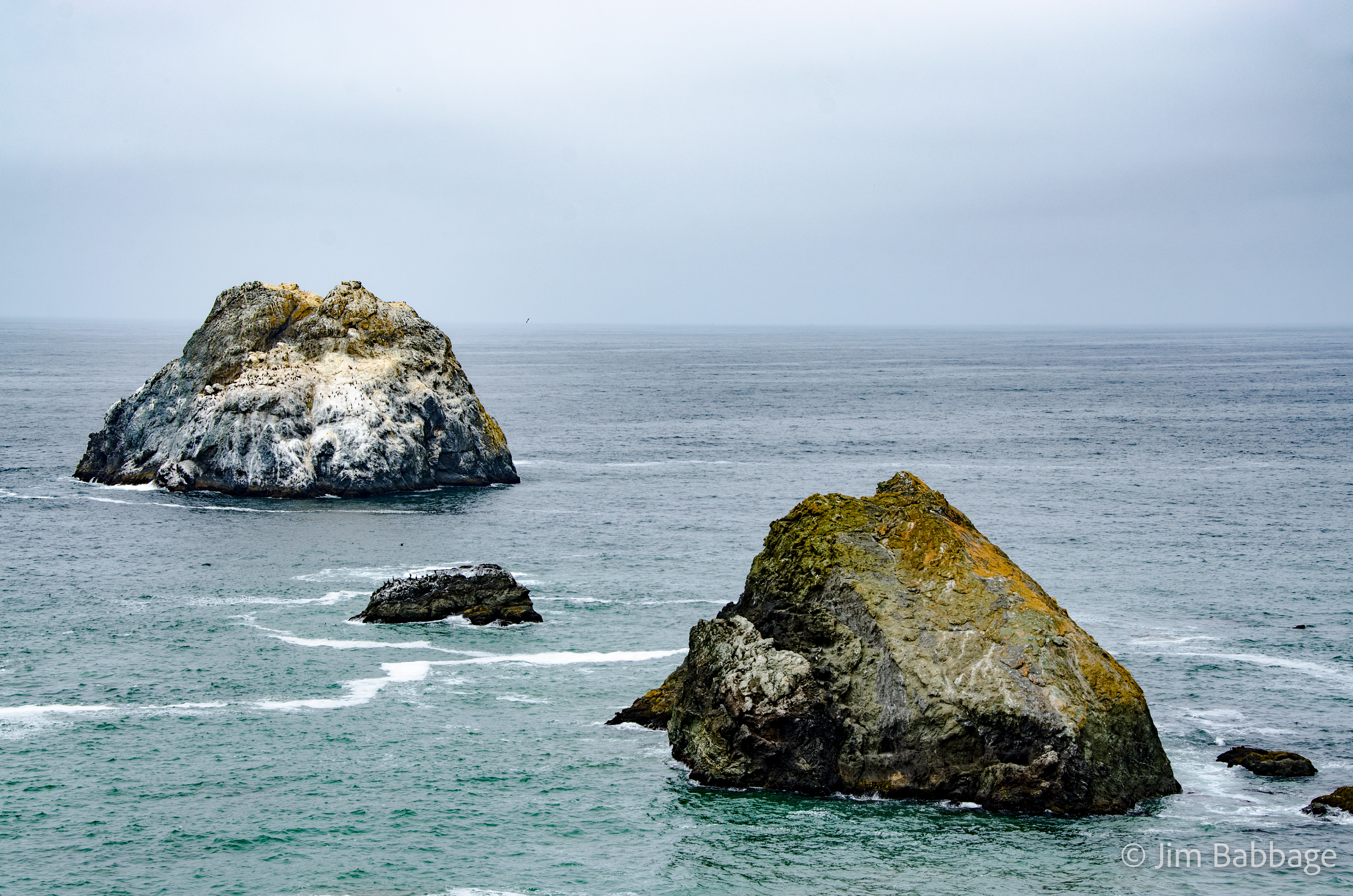
Example #5 - Color to Black and White Conversion
This is a quick comparison. In fact, this work was done well over a year ago, long before Dehaze was even part of Lightroom CC. I liked the image composition, but the original color image lacked any real drama. With the heavy overcast, the strength of this image resided in the detail and texture and contrast.
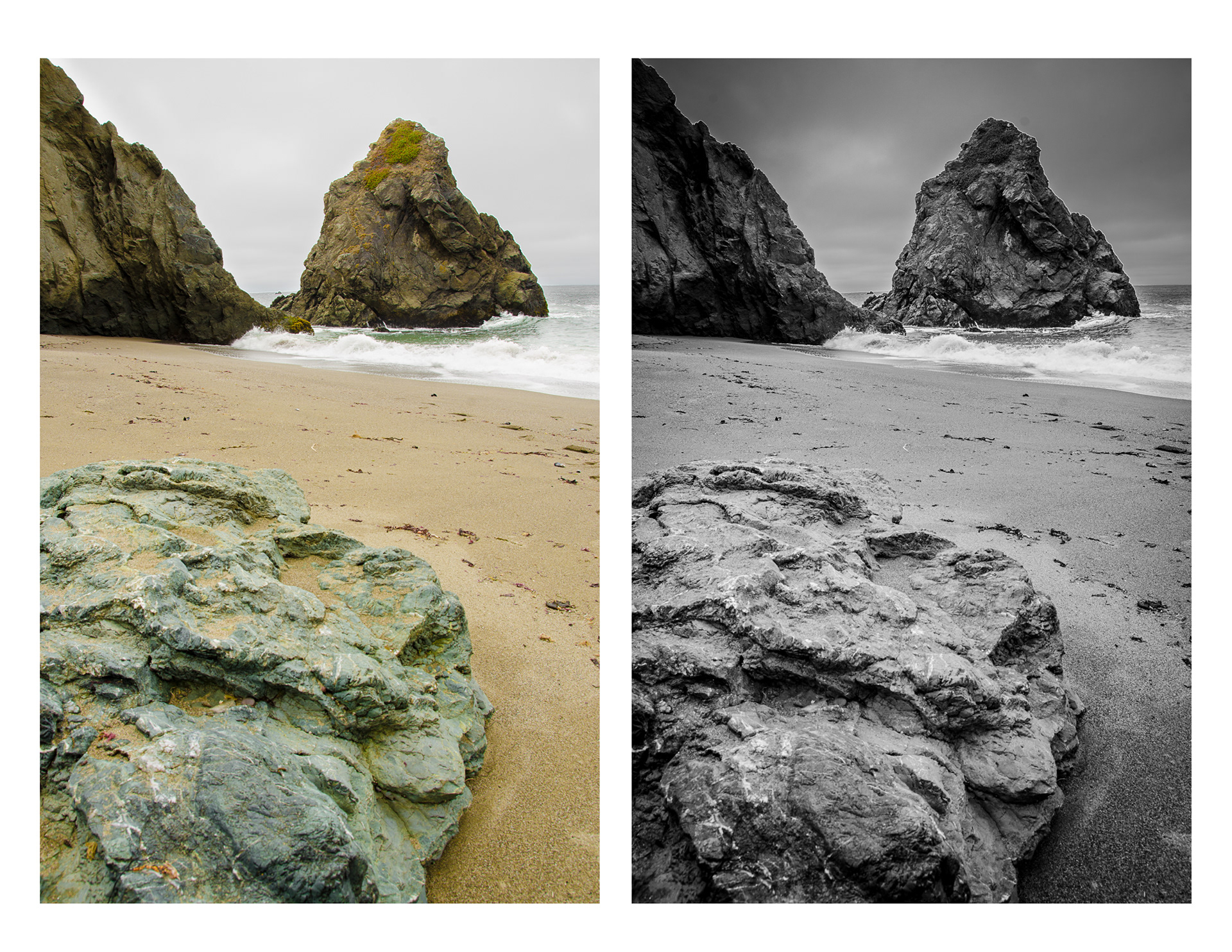
Converting to black and white created a range of new options: contrast alterations, vignetting, grain, color toning. On a side note, Don't you just expect Charleton Hesten to come riding around the rock face on the shoreline, Nova in tow? Name that movie, friends. ;-)
Wrap up
Well that's it for this tutorial. I hope I've opened your eyes to not just the benefits of the Dehaze tool, but also how to apply it and other controls to bring out the best in your shots. And most importantly, I hope you walk away with the knowledge that many images deserve a second - or even third - look. As your skills in photography, observation - and the tools you use - evolve, so do your opportunities to look at your images with fresh eyes - and new ideas.