
There are a scant few weekends left before we close up the cottage for the season. And while this past weekend was mostly overcast, it provided some great opportunities for capturing fall color. Some don't realize that overcast skies are actually great for shooting fall leaves, chiefly due to the reduction in contrast. With the lack of strong shadows, you can focus on subtle detail, richer color close up and in larger landscapes, avoid situations where you are battling with excessively bright highlights and deep, dark shadows.
The trick - often, not always - to shooting fall color on an overcast day is to minimize the percentage of cloud cover in your photos. When that grey sky is nothing but a dull, monotone backdrop with no detail or texture, it usually doesn't improve your images. It can even make them appear less vibrant and interesting.
I'm the first to admit that I take full advantage of Adobe Lightroom when processing my fall shots (teaser - I was also testing out something new to process some of my work but can't say more than that). Original RAW files are often dull when imported and the last thing you want in autumn shots is dull.
This series is from two different areas around Rice Lake: River Road in Asphodel-Norwood Township, and Villiers Line, the road into the cottage.
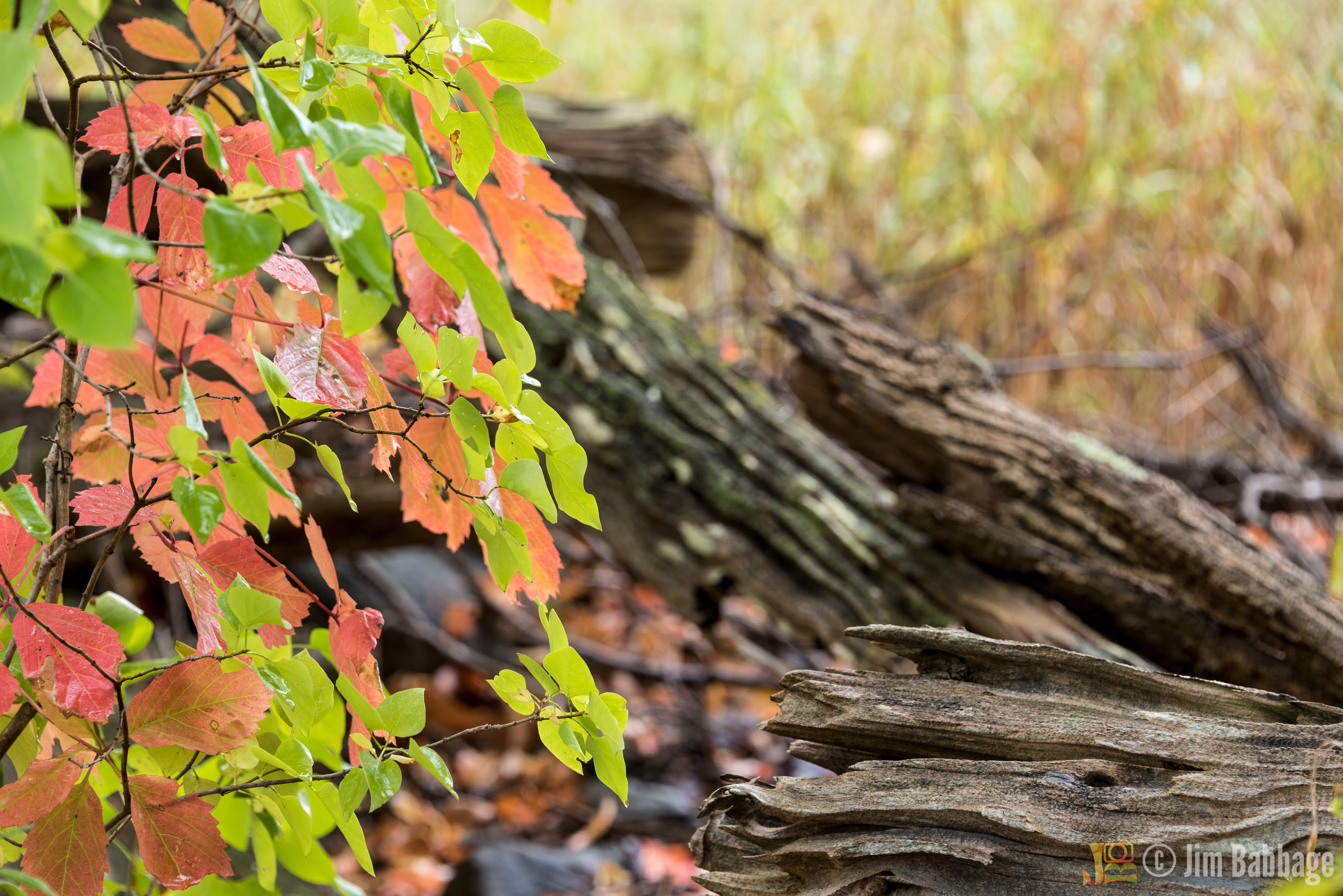
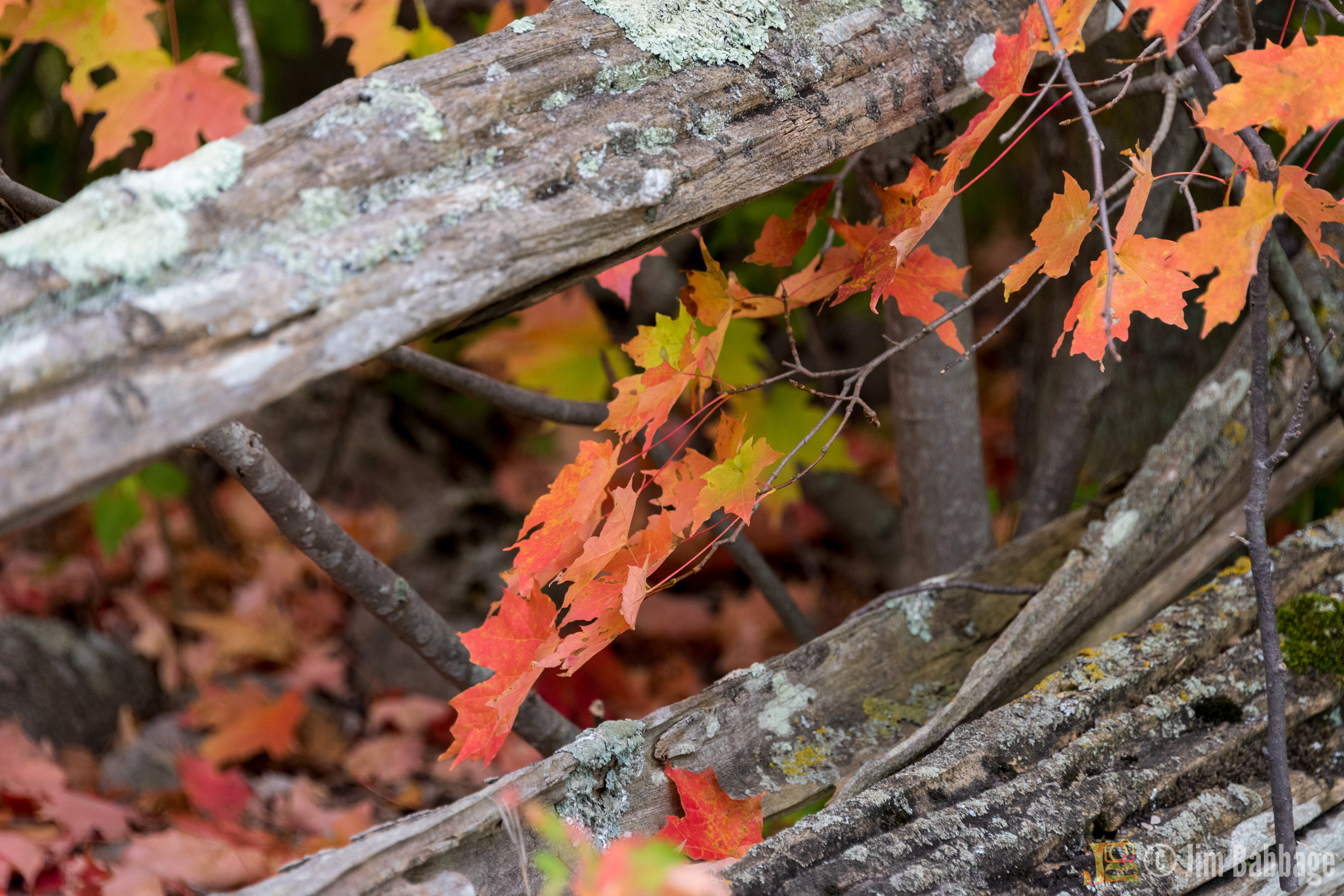
Observation: I didn't realize it at the time, but I was really making use of shallow depth of field in many images. This wasn't a lighting/exposure restriction so much as a sub-conscious creative choice.
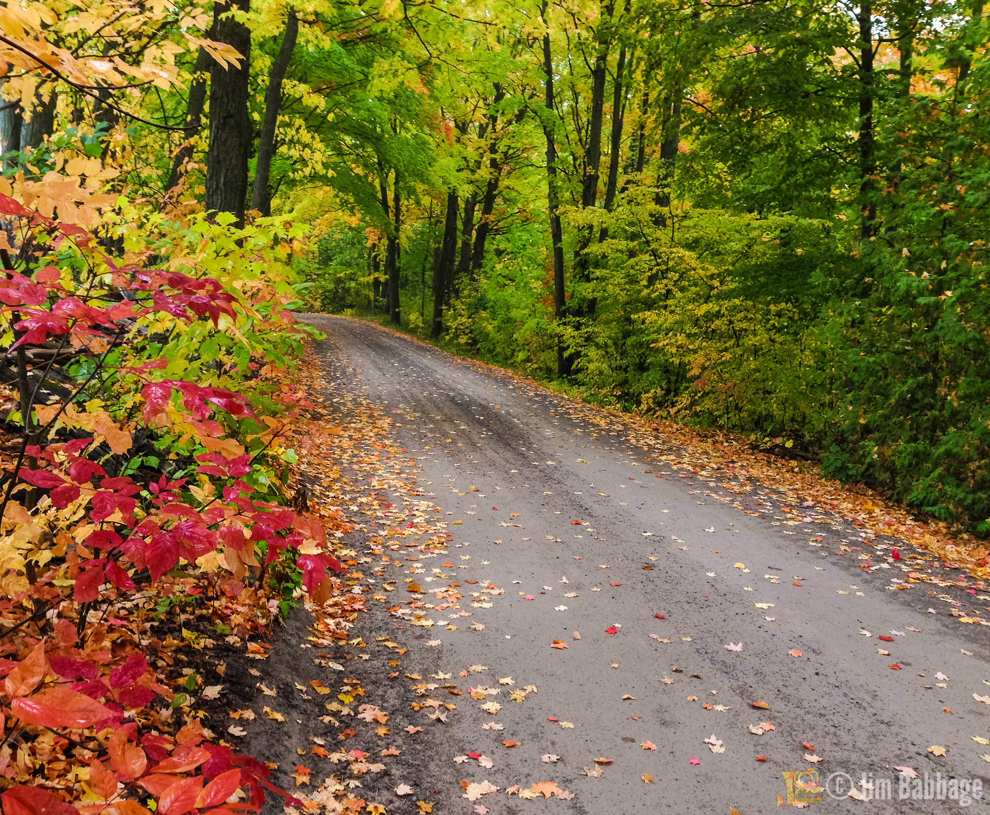
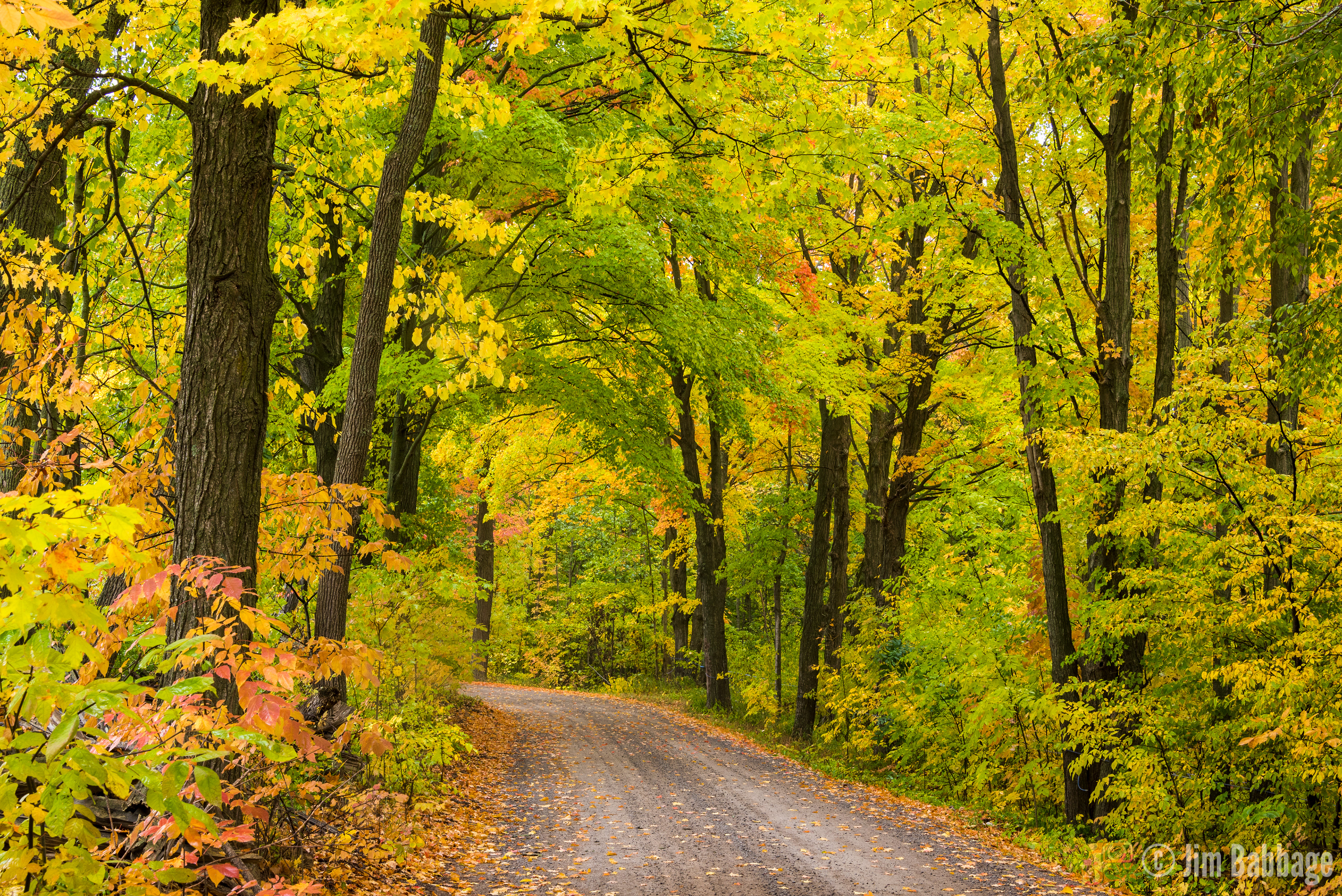
River Road/Asphodel Line 3/Line 2
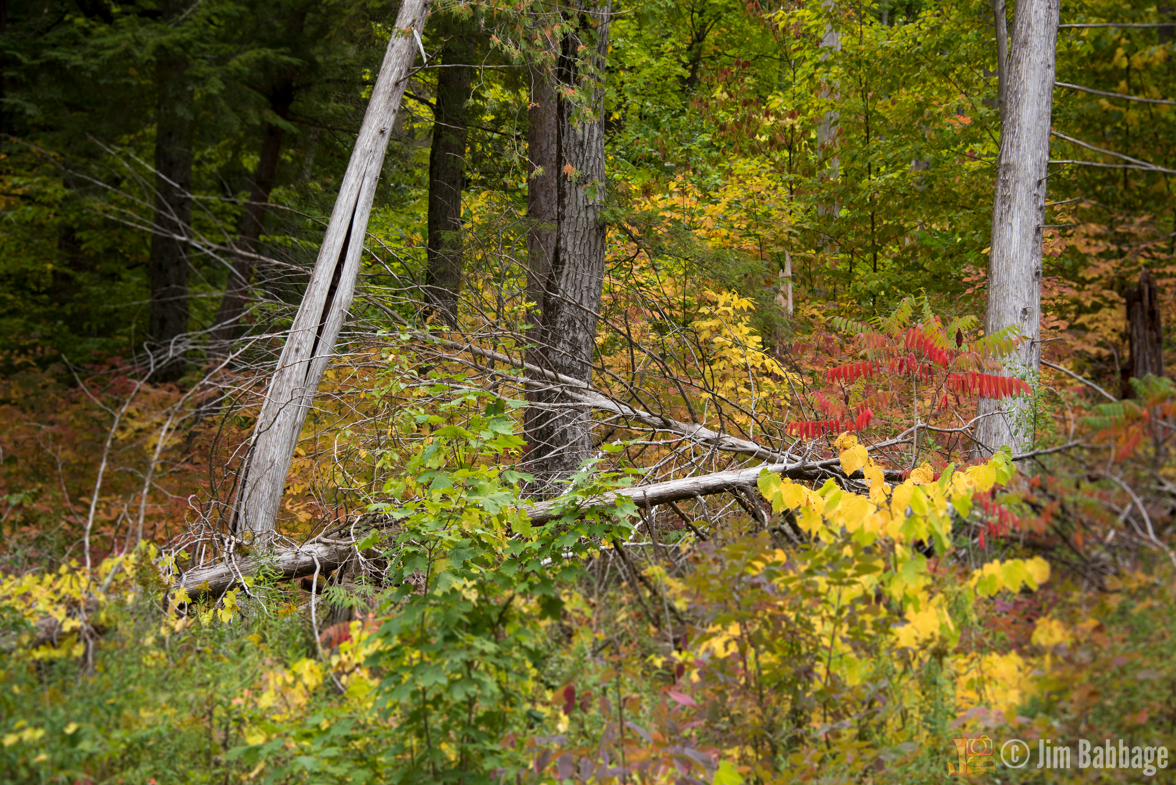
As I drove down Asphodel Line 3, on my way to check out an area called Asphodel Heights, the intersection of River Road and Asphodel Line 3 stopped me dead in my tracks. Not only was the fall color impressive, there were signs posted to warn drivers the road was a summer-only road and not maintained in the winter (at least not by the municipality). Well, that was enough of an excuse for me!
I made three trips to this road in less than 24 hours: when I discovered it late afternoon on Saturday, then Sunday morning for more photography, and finally early Sunday afternoon, I took my wife and her friend on a little fall colour tour, of which River Road was the feature attraction.


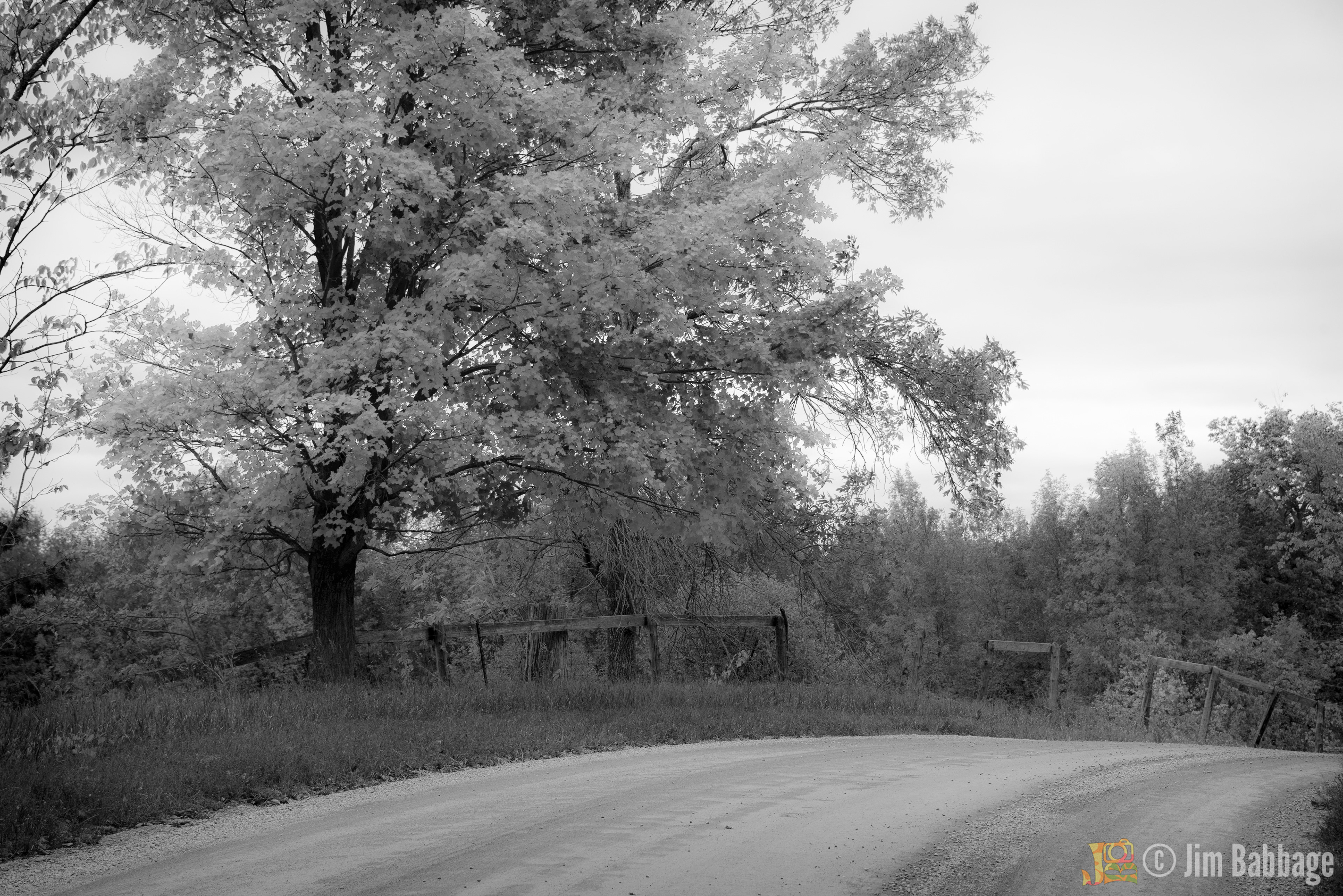
While this maple tree was a brilliant red, the vast amount of grey sky with little detail made for a lack-lustre color image. However, by converting to black and white and giving the image a soft, infra-red look, I think it regained some interest, even though it no longer screams "autumn".

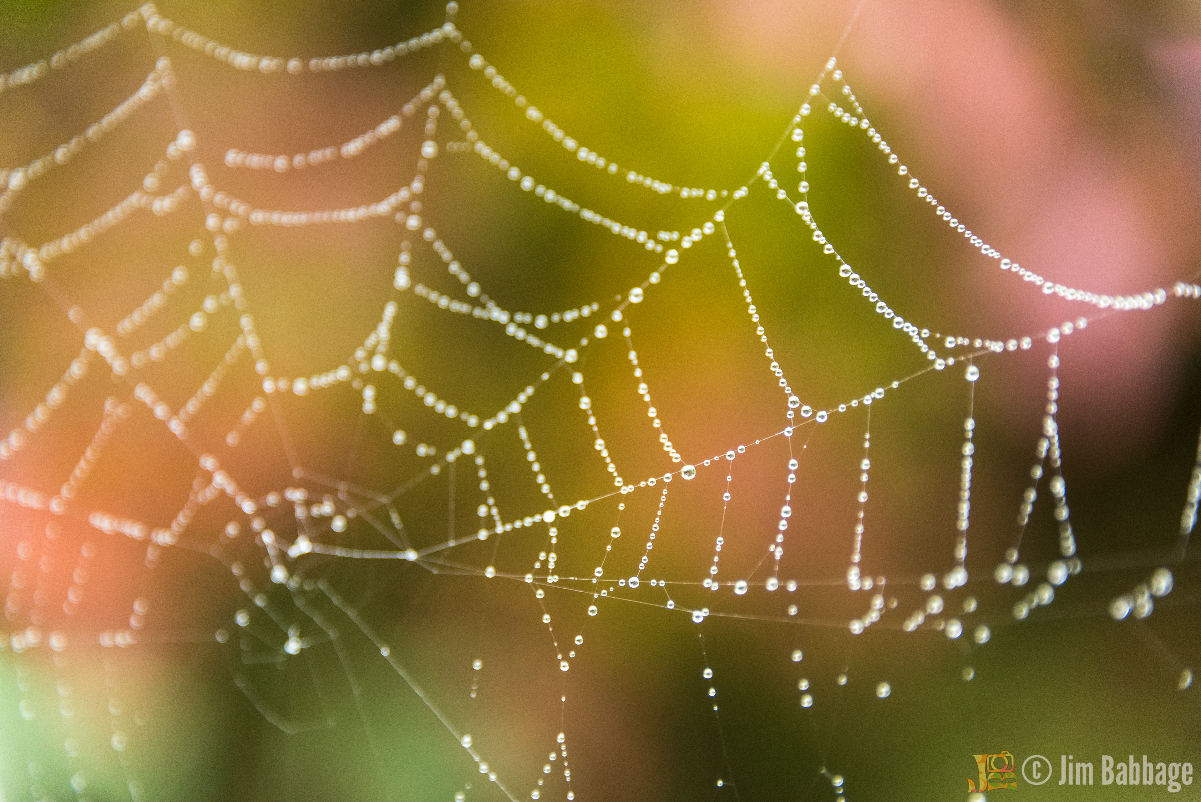
I was sitting in my car, getting ready to leave the area and head back to the cottage, when I spied this spider web, bejeweled with dew. I have no idea how I did NOT see it in the first place, but it was enough to get me back out of hte car, camera and tripod in hand. I know spider web shots are a dime a dozen these days, but the fall color behind the web and the shallow depth of field made the image special enough for me to include here.
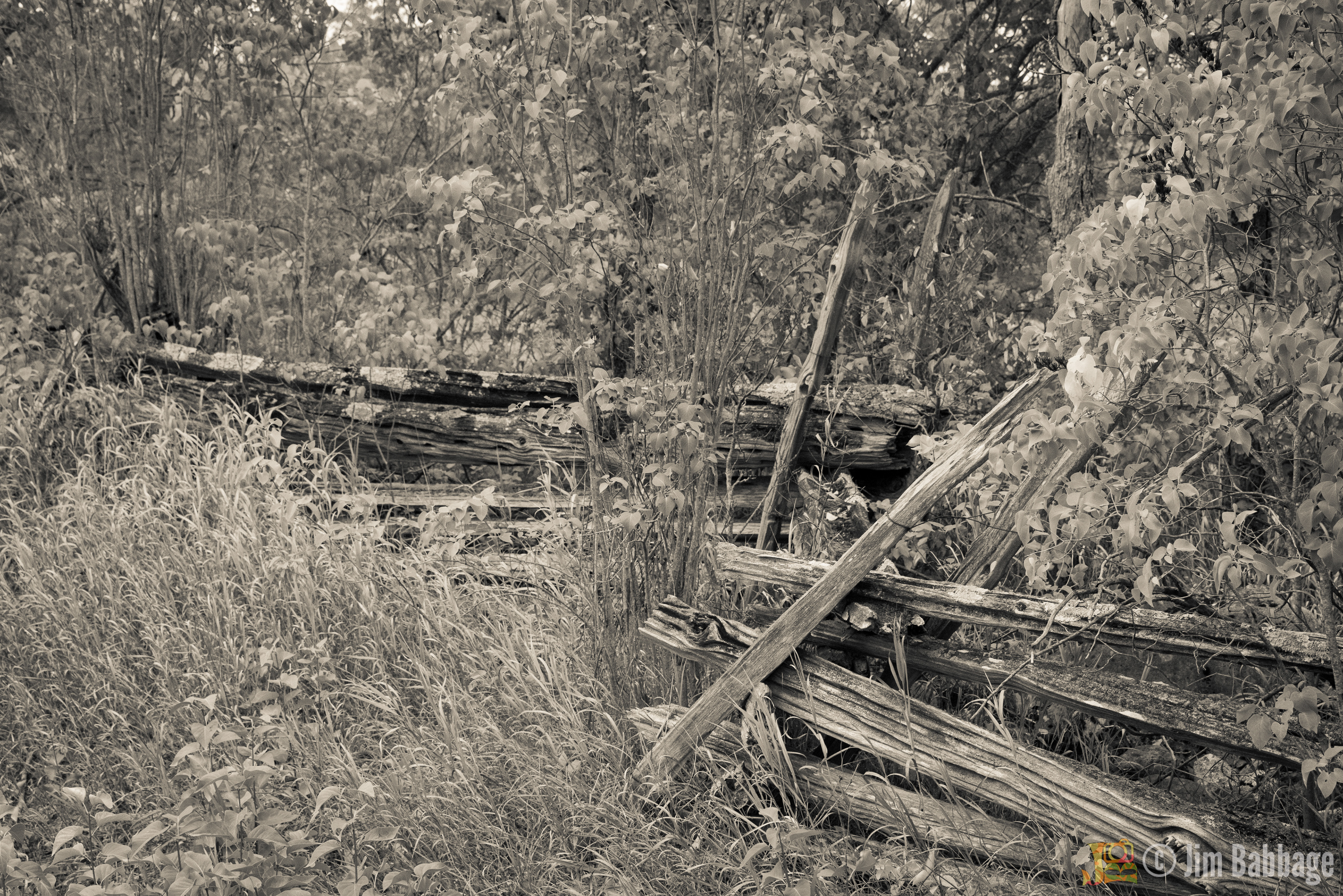
Another example of an image that was too visually confusing and - well - uninteresting - when presented as a colour image. By treating it as sepia-styled image, the eye focuses back on the split rail fence and moves through the scene more effectively.

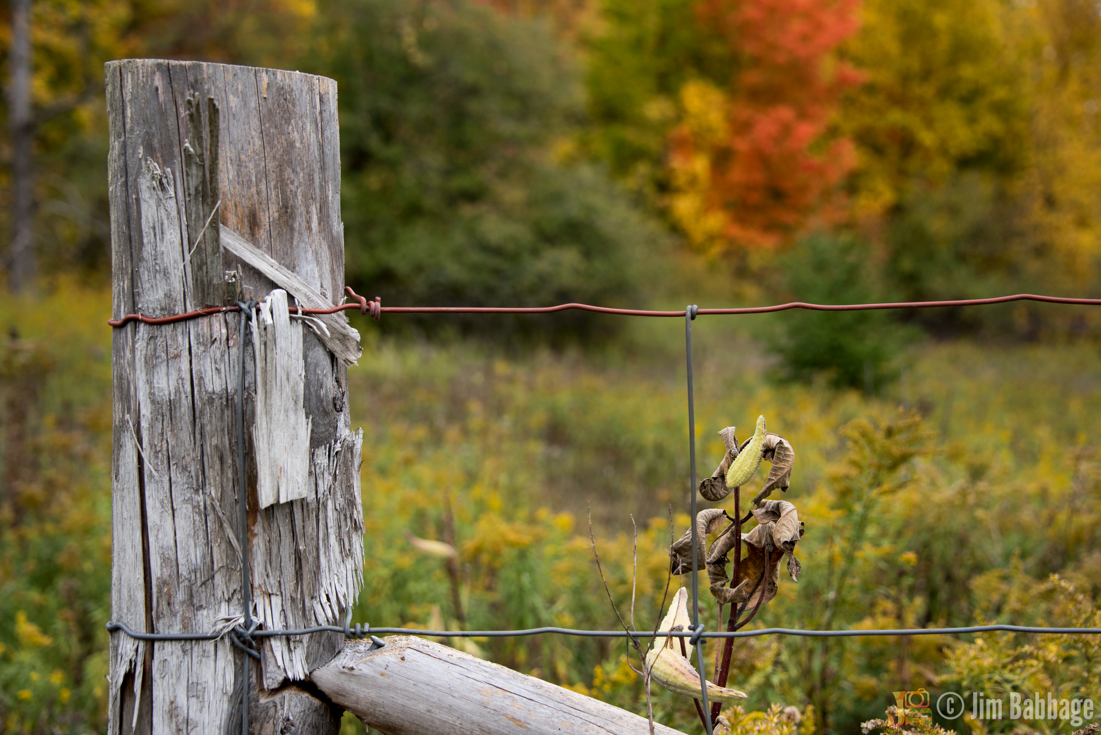
Villiers Line
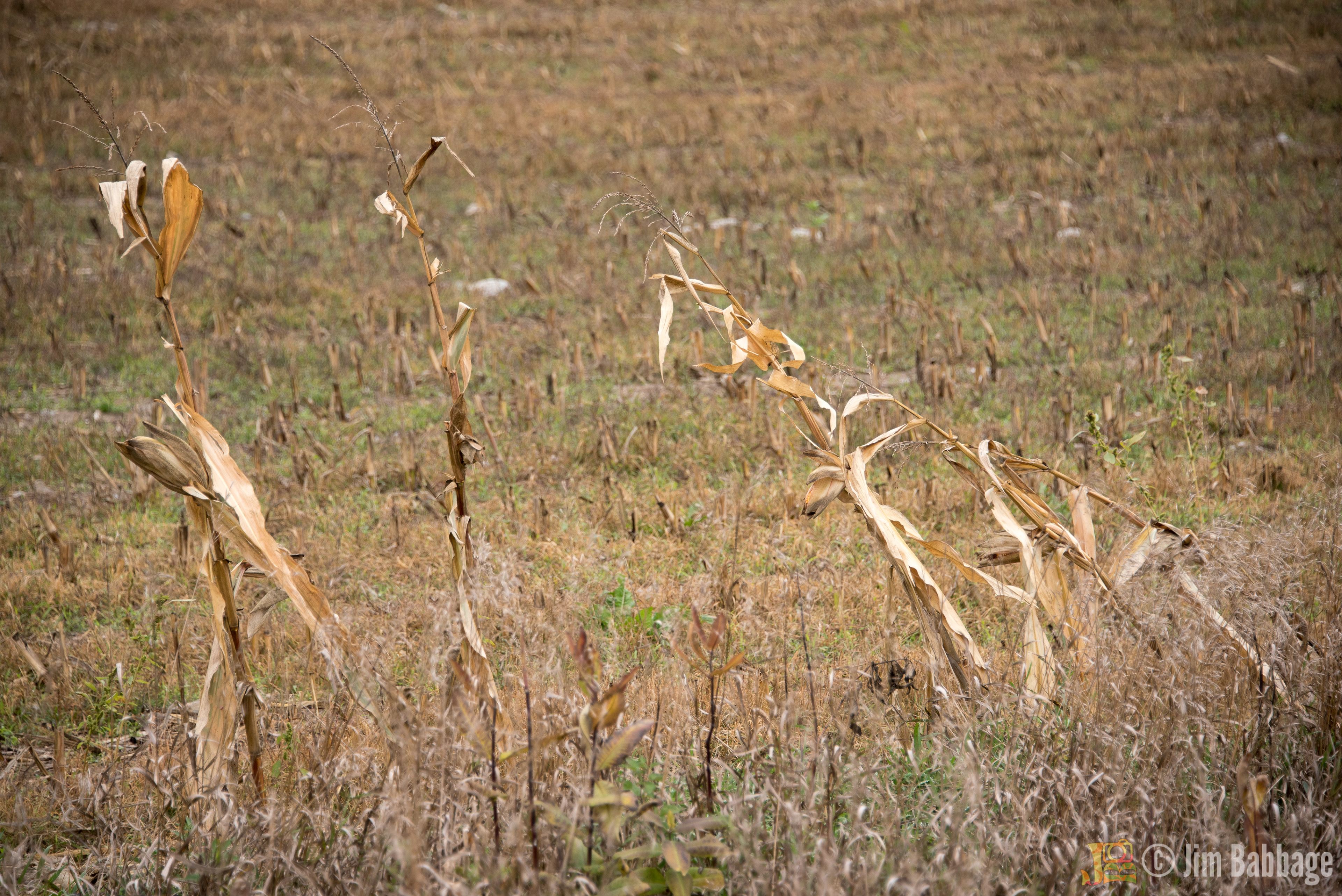
The road into the cottage is a lovely drive. On either side of the road, the view is in constant flux as fields are sown, grown and harvested.

I confess to having more than a passing interest in older farming equipment; it's all very practical, often large in scale and looks as if it could rend you limb from limb if you got on the wrong side of it.
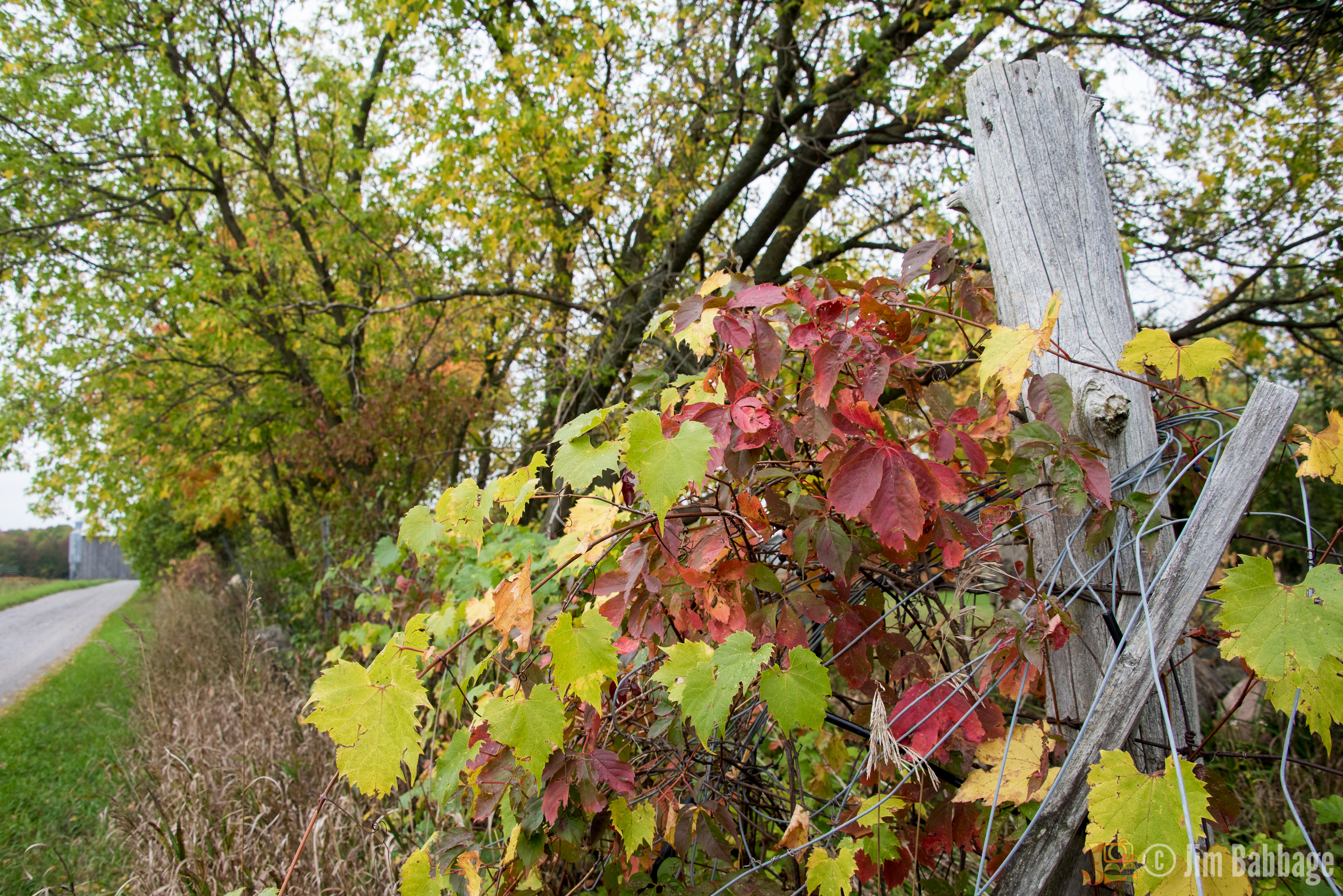
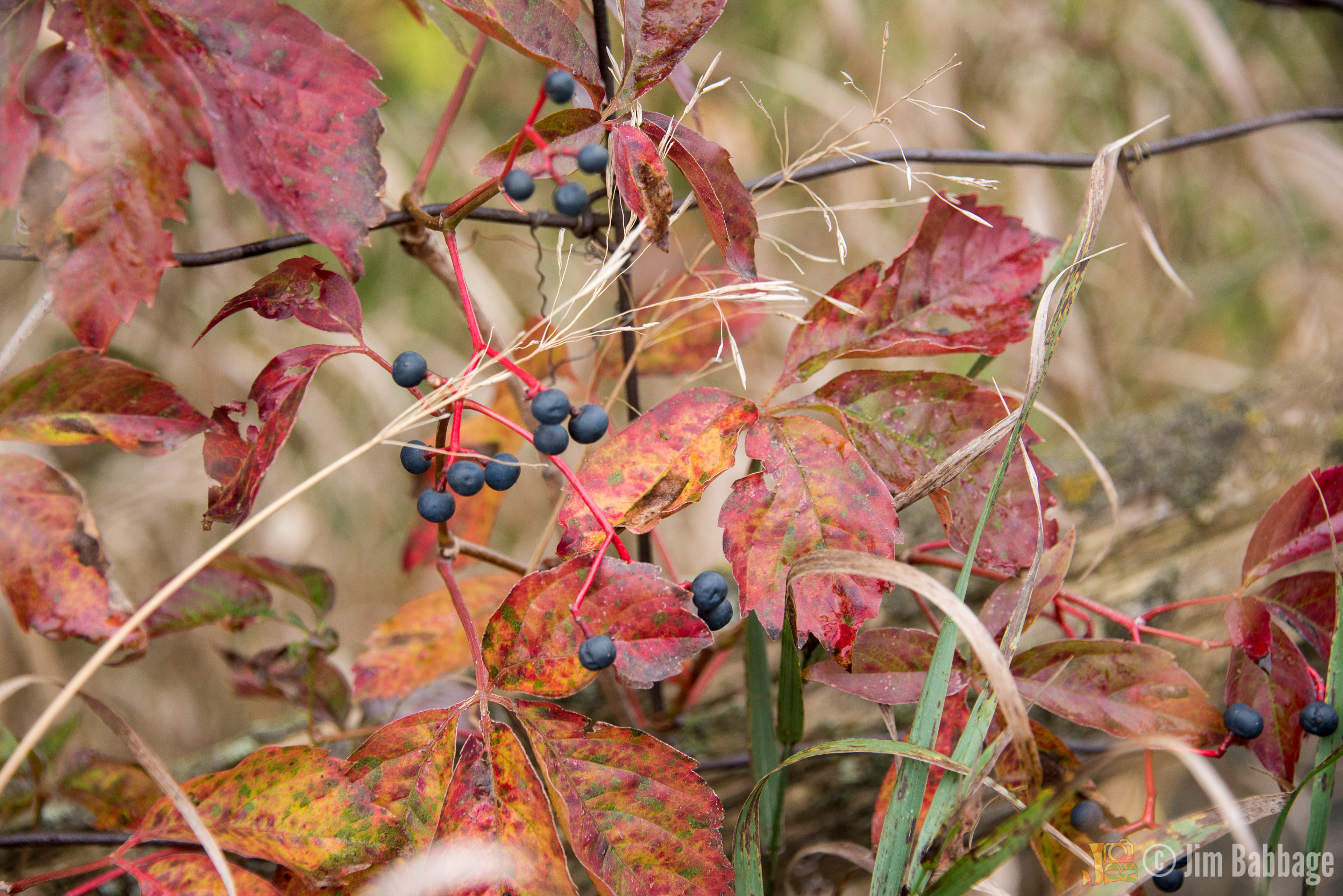
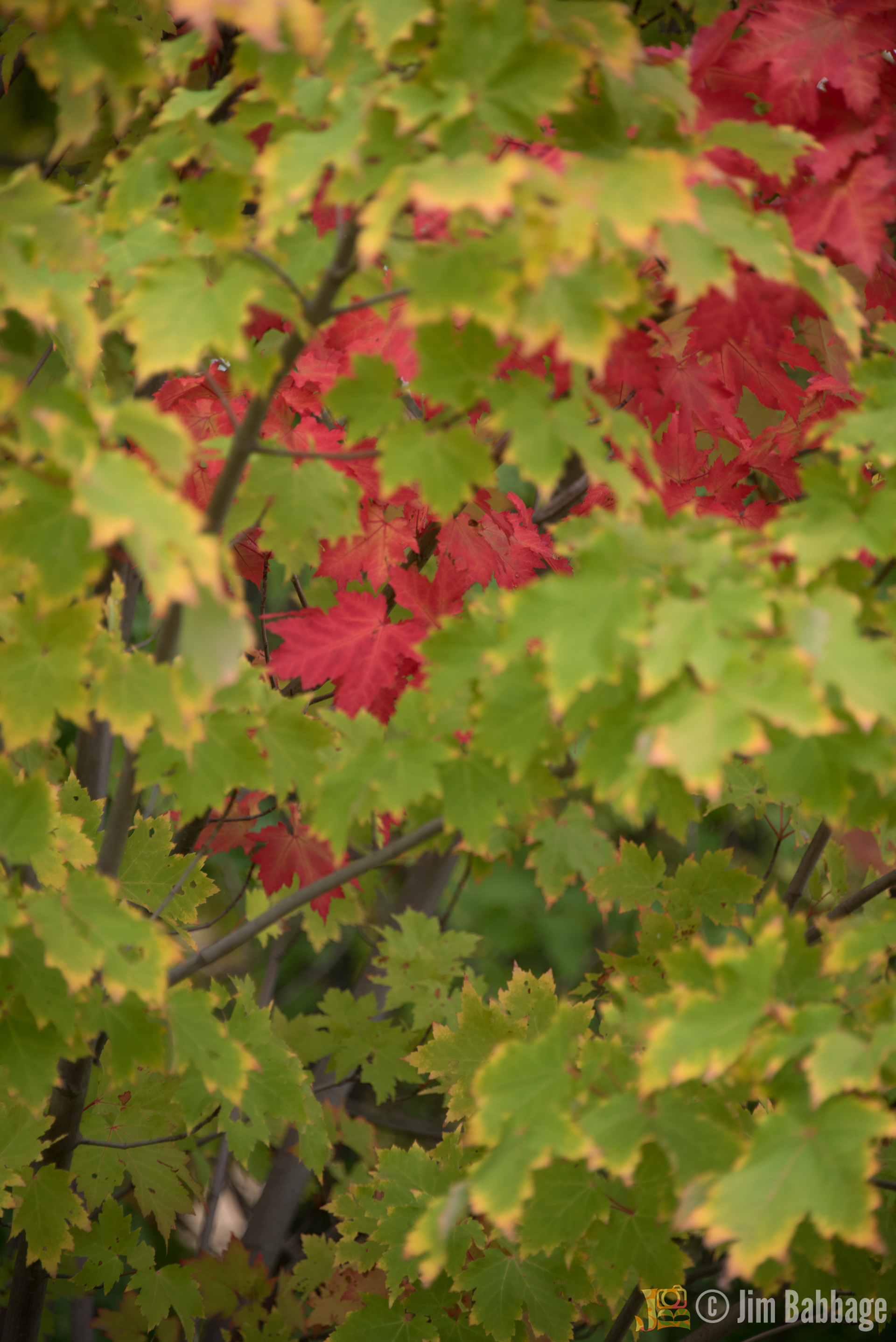
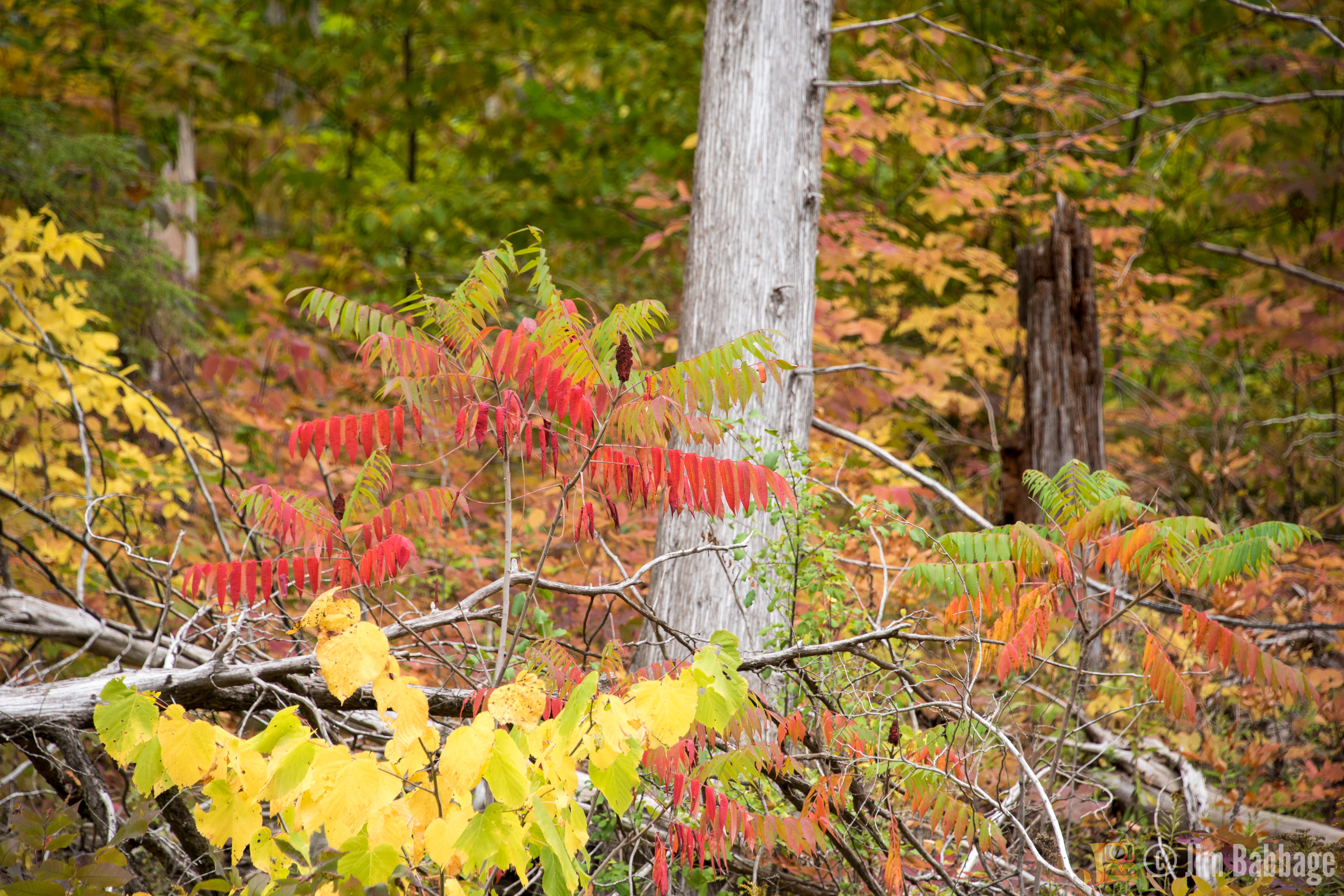
Fall colour is not just limited to trees; wild grapevine and other creeping vegetation offer up their own autumnal hues.

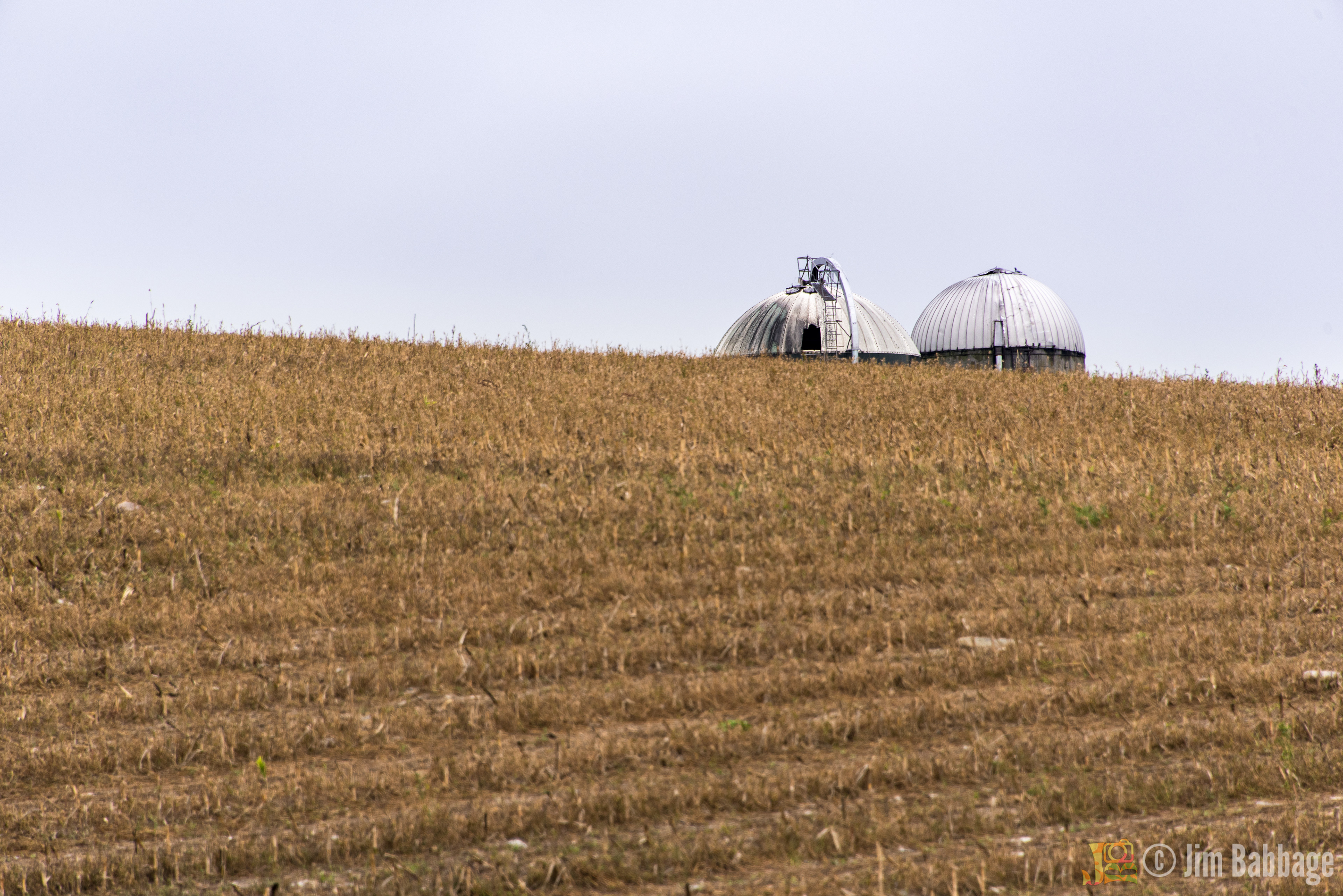
I am not sure why, but this pair of silos has fascinated me - visually - since the very first time I drove this road. It always seemed that the right combination of lighting, timing and camera equipment was never available when I would pass the silos by - until this time. With the soft light and harvested field, I think they have a bit of a ominous feel as the silos peek out from the top of the hill. It's also an example of when I felt the negative space/contrast created by a smooth blue/grey sky actually worked for the composition. Remember, there are no rules - only suggestions.
Working with graduated filters to soften the perimeter of the shot and also darken those areas. Interestingly, when I published this image for Adobe Stock, I removed all of those "creative license" effects. I've had a few of my images rejected for "over-processing" so I'm trying to learn what works best.
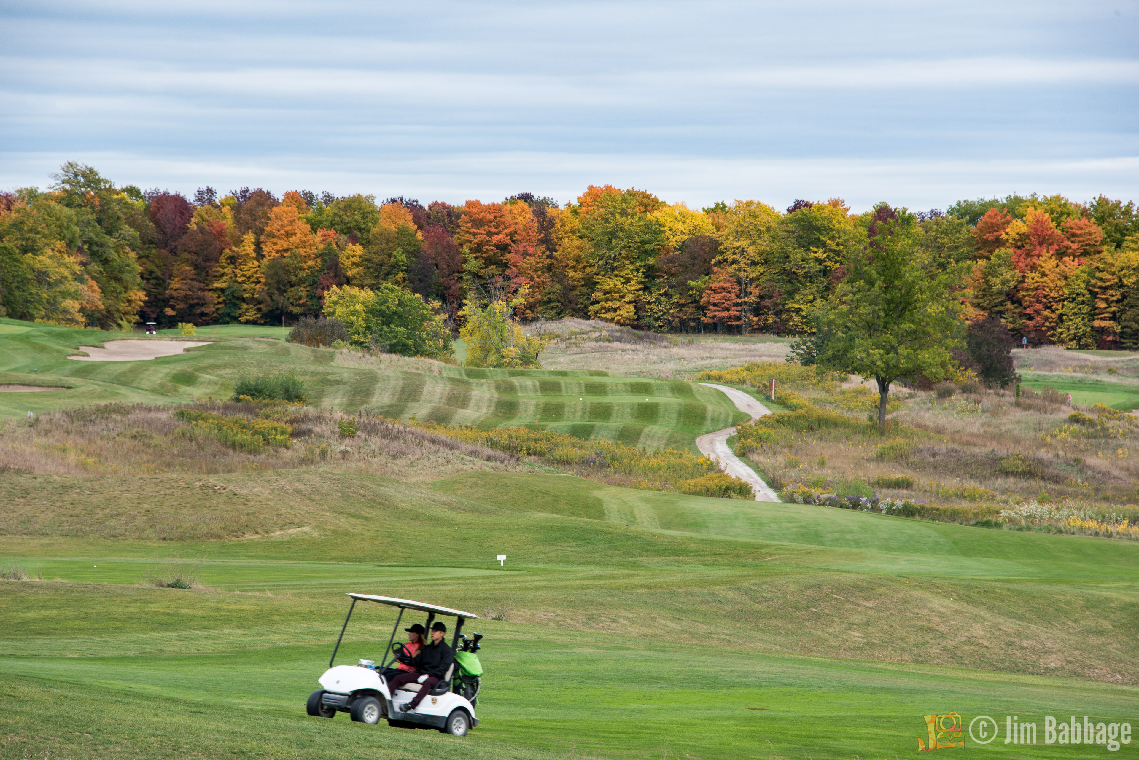
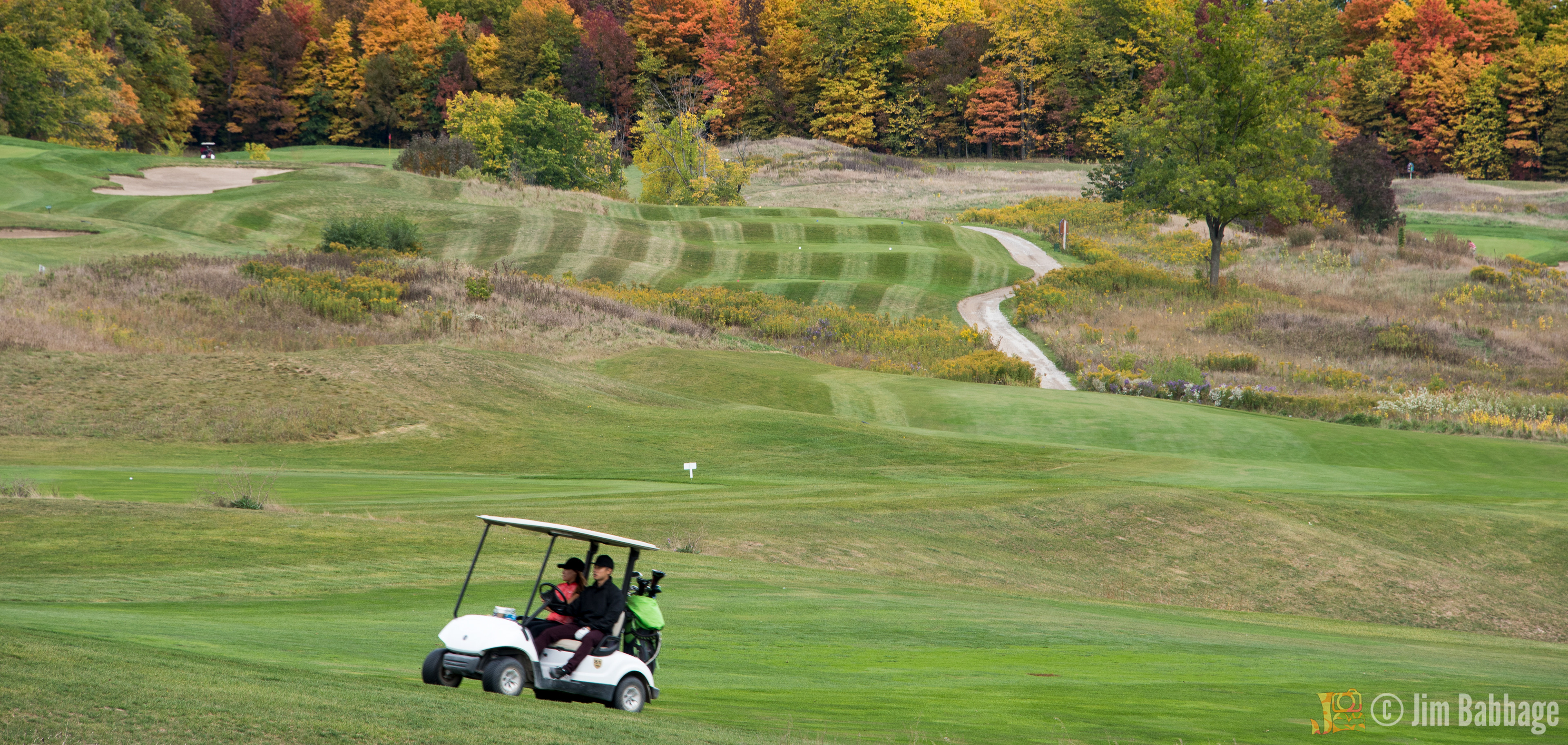
Remember my comment about overcast skies? Well, in this case I was able to pull out some texture/detail in the clouds, so I opted to leave it in as my first choice, but I'm also including a secondary version, with the sky cropped out completely, making more of a panoramic image (below). What do you think? Which way would you go? Which is more effective?
Well there you have autumn in my neck of cottage country. I'll see what this coming Canadian Thanksgiving weekend brings, but the leaves are dropping quickly. Who knows what will be left in a few short days?